AI art generator
AI Watercolor Generator with Real Paper Texture and Wet Edges
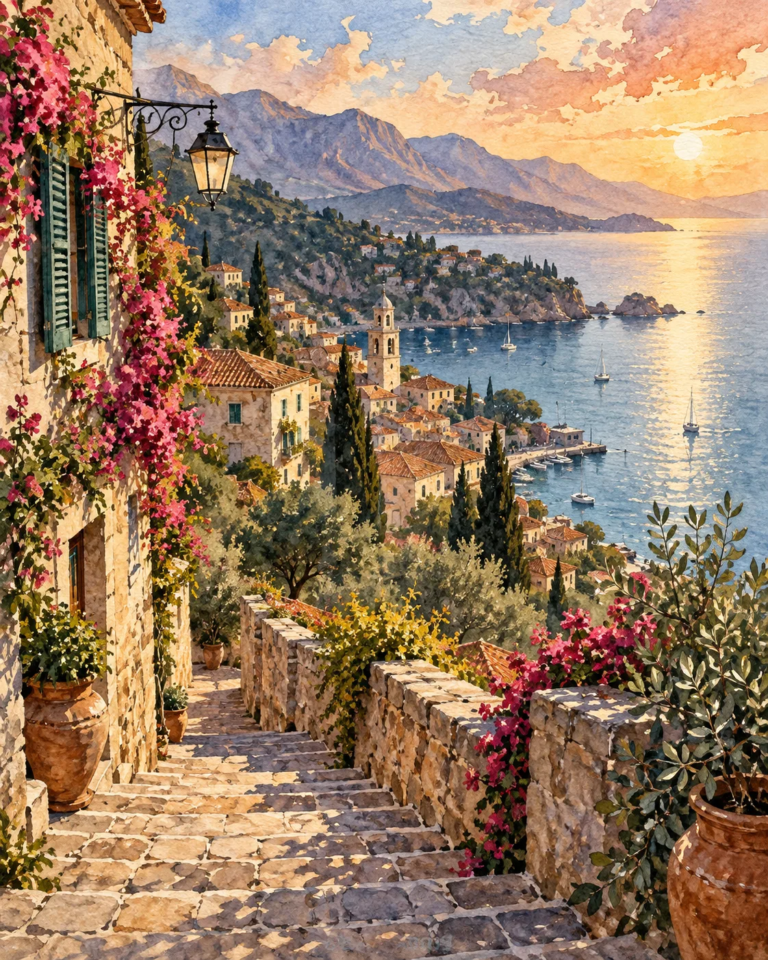
Watercolor looks effortless because of what the painter leaves out: bare paper for highlights, soft bleeds where colors meet, a few crisp edges where it matters. Prompts that describe those qualities get far closer to a real painting than ones that simply say 'watercolor style'.
Made with OpenDream
How it works
- 01
Describe the paper
Ask for 'cold-press watercolor paper texture' or 'rough paper grain visible in the washes'. Texture is the first thing that makes a watercolor look physical.
- 02
Ask for wet and dry edges
Combine 'soft wet-in-wet bleeds in the sky' with 'crisp dry-brush edges on the rooftops'. The contrast between loose and tight areas is the heart of the medium.
- 03
Leave white space
Request 'unpainted white paper for highlights' and 'loose vignette edges fading to white'. Restraint keeps the image airy.
Why create AI watercolor generator with OpenDream
Travel sketches
Street corners, cafés and harbors painted loosely with ink lines, like pages from a travel journal. The Watercolor Village template starts you there.
Botanical studies
Flowers, leaves and herbs painted on white with visible layering, suited to prints, cards and the Botanical Poster template.
Soft portraits
Faces built from loose washes with a few precise touches around the eyes, for gifts and book art.
Wedding and stationery art
Venue sketches, floral borders and backgrounds for invitations; add names and dates afterwards in a design tool.
Painting with restraint: how watercolor actually behaves
Real watercolor is transparent. Painters build color in thin glazes and rely on the white of the paper for every highlight, since traditional watercolor uses no white paint. When a prompt asks for 'bright highlights', a model may paint them opaque; asking for 'highlights left as bare paper' produces the luminous look instead.
Edges carry the style. Wet-in-wet passages, where paint meets damp paper, create soft blooms and feathered bleeds, usually in skies, water and backgrounds. Dry-brush and hard edges appear wherever the painter wants focus. Describe both and say where each belongs, and the image gains the push and pull of a real painting.
Paper and pigment behavior add authenticity: granulating pigments that settle into the grain, backruns (cauliflower-shaped blooms that form when water flows into a drying wash), and darker rims where a wash has dried. One or two of these is enough; listing all of them tends to overload the picture.
Resist over-completion. A watercolor that fills every corner with saturated color looks like digital art with a filter. Keep to three or four pigments, let the subject fade into white paper at the edges, and consider ink line work for buildings, which gives structure while the washes stay loose.
Prompt examples
Morning harbor sketch
Loose watercolor painting of a small fishing harbor in the morning, colorful boats, stacked houses on the hill, soft wet-in-wet sky, crisp dry-brush edges on rooftops, fine ink line accents, highlights left as bare paper, cold-press paper texture, edges fading to white
Placing wet and dry techniques in specific areas gives the painting a clear focal structure.
Try this promptFoxglove botanical
Botanical watercolor study of foxglove and fern leaves on white paper, transparent layered glazes, granulating purple and sap green pigments, visible pencil underdrawing, soft shadow washes, plenty of empty white space, vertical composition
Pencil underdrawing and granulating pigments are the details that make botanical studies look hand-painted.
Try this promptRainy café street
Watercolor street scene on a rainy evening, glowing café windows, blurred umbrellas, reflections bleeding into the wet pavement, limited palette of indigo, burnt sienna and yellow ochre, loose brushwork, rough paper grain
A three-pigment palette keeps colors harmonious, the way a painter's limited palette would.
Try this promptLoose watercolor portrait
Watercolor portrait of a fictional woman with short dark hair, loose washes of warm skin tones, cool violet shadows, precise detail only around the eyes and lips, hair dissolving into soft bleeds, white paper background
Concentrating detail at the eyes and letting the rest dissolve is how painters keep portraits fresh.
Try this promptMinimal mountain lake
Minimal watercolor landscape of a mountain lake, pale blue wash sky with a single backrun bloom, gray-violet mountains in two values, a thin line of dark pines, still reflection, most of the paper left white
Very few values and lots of white paper produce restrained, airy work.
Try this prompt
Start from a template
Frequently asked questions
- Why does my watercolor look like a digital painting?
- Usually too much saturated color and no paper texture. Add paper grain, ask for highlights as bare paper and limit the palette. Words like 'detailed' and 'vibrant' push toward a digital finish.
- Can I turn my photo into a watercolor?
- Yes. Upload the photo as a reference image and describe the watercolor treatment you want. The image-to-image page explains how references and prompts work together.
- Does watercolor work for printed cards and invitations?
- It is a popular choice. Generate at the card ratio, keep space for wording, and upscale before printing so the paper texture stays crisp. Set names and dates in a design tool rather than in the prompt.
Keep exploring
Ready to create?
Pick a plan and you only spend credits on images you actually receive.
Start creating